


Flexbox is a powerful layout tool in CSS that allows developers to create complex and responsive layouts with ease. It has become an essential skill for web designers and developers, enabling them to create modern and visually appealing user interfaces. However, mastering the Flexbox can be a daunting task, especially for beginners. That's why we have put together a cheat sheet for Flexbox, which provides a quick and easy reference guide to the most important Flexbox properties and values. This article aims to demystify Flexbox and help developers to create stunning and responsive layouts in no time.
Introduction
Flexbox is a CSS (Cascading Style Sheets) layout technology that aids developers in producing adjustable and adaptable layouts for websites. It enables developers to align and distribute elements within a container in a flexible manner. Without the need to utilize convoluted CSS hacks or JavaScript, Flexbox allows developers to quickly manipulate the positioning, size, and order of components within a container.
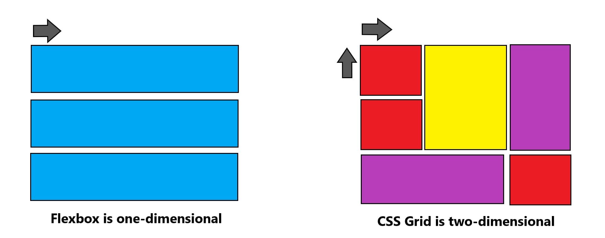
The CSS flexbox contains flex containers and flex items which are different from the standard CSS grid layout. The main difference between the standard layouts (block, which is vertically based, and inline, which is horizontally based) and the flexbox layout is that the latter is straight line-agnostic. Small-scale layouts and application components are best suited for flexbox layout.
Terminologies and Axis
Flexbox involves a lot of things and it is an entire module, to be honest, and not just a single property. Let's start to understand the flexbox with the basic terminologies like 'flex-container', 'main axis', and 'cross-axis'.
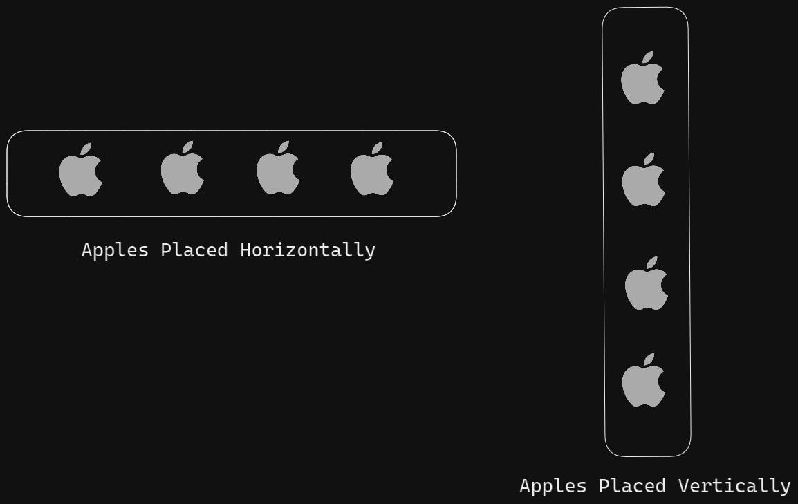
Let's imagine there is a fruit crate under which many apples are being placed. Now there are multiple ways to arrange an apple inside the crate. You can either place 8 apples horizontally or pile them to one another. In the same way 'flex-container' is that one crate and 'div' are those apples that need to be placed.
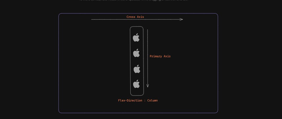
In the official terminology, we call it as 'main axis' and 'cross axis'.

I hope you have got the idea from the above image that either the main axis (from main-start to main-end) or the cross axis (from cross-start to cross-end) will determine how the items are arranged.
Main Axis
This is the primary axis in which flex items(remember the apple example) are laid out. The primary axis entirely depends upon the flex direction.
Point to RememberIf the flex-direction is row, the primary axis is left to right. In the case of flex-direction is a column then the primary axis is top to bottom.


Main Start/End
All the flex items or containers(apples in our case) are placed between the main start and main end within the container.
Main Size
The main size is the flex container's dimension in terms of its height and width whichever the direction of flex is.
Cross Axis
In simple terms, the axis perpendicular to the main axis is termed a cross-axis. Its direction solely depends upon the main axis direction. To find the cross axis, it is usually suggested to find the main axis first.

Cross Start/End
All the cross-axis items inside the flex containers are being placed into the container starting from the cross-start side towards the cross-end side of the flex container.
Cross Size
The cross size is the cross dimension of the container. It may be its height or width depending entirely upon the flex-direction.
Properties of Flexbox
Now, here comes the most crucial part of the documents where we are going to discuss the properties and values of the Flexbox Properties.
Display property
Suppose we have a normal container that has some items inside it and we want to make it Flex enable, then we are going to use the display property. The display property enables a flex context for all its direct children. For example, check the below circle.
display:flex;
Flex Direction
The flex-direction is one of the important properties which defines whether the flex's child elements should be laid out horizontally(row) and vertically(column).
Note: When we say display: flex, the default direction for the flexbox is row.
display:flex;
flex-direction:row;  /*In case of row arrangement*/
flex-direction:column; /*In case of column arrangement*/
flex-direction:row-reverse; /*In case of row reverse arrangement*/
flex-direction:column-reverse; /*In case of column reverse arrangement*/
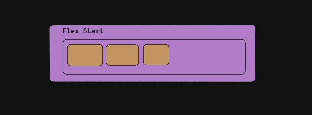
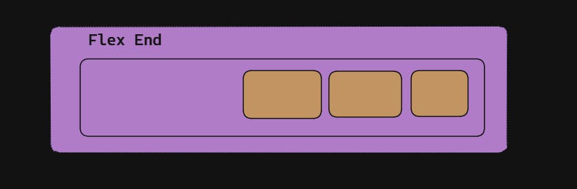
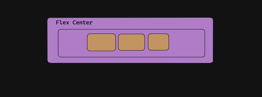
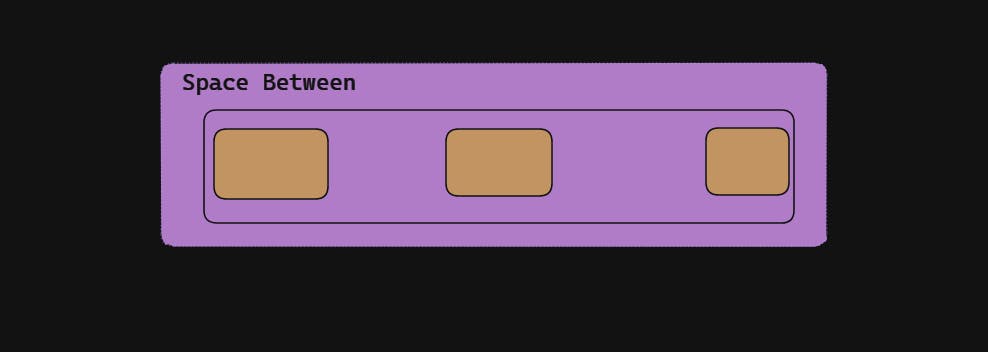
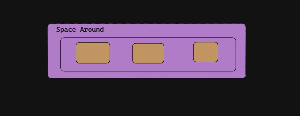
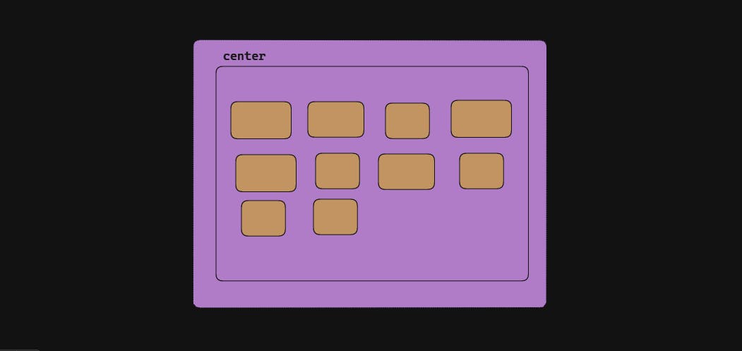
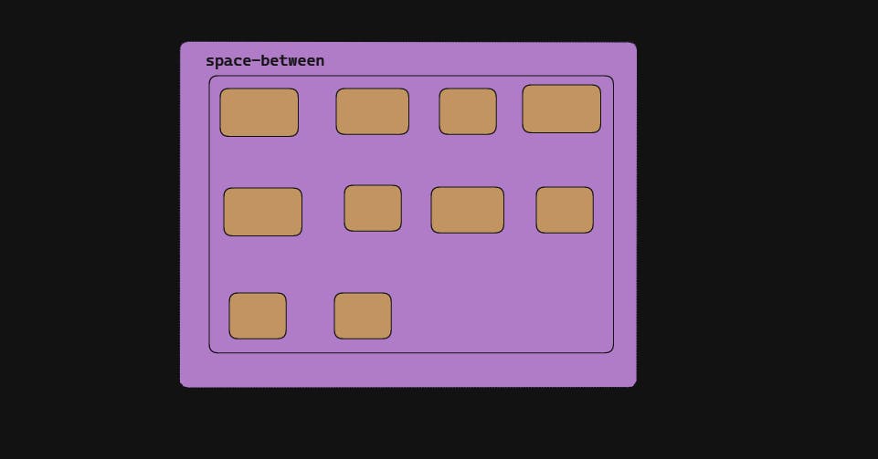
Justify Content
The property justify-content works only on the main axis of the flex container. This is used to define how the child elements should be aligned along the main axis of the flex container. The property helps us distribute the extra free space available on the main axis and helps us to align the items in case of an overflow of items.
justify-content:flex-start; /*items are packed toward the start of the flex-direction.*/
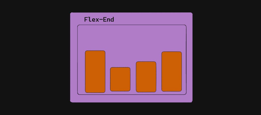
justify-content:flex-end; /*items are packed toward the end of the flex-direction.*/
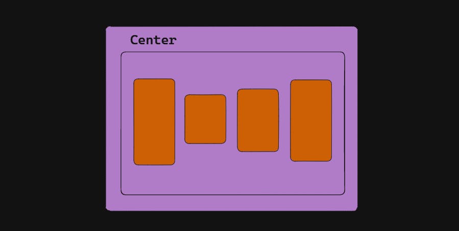
justify-content:center; /*items are packed toward the center of the main axis direction.*/
justify-content:space-between; /*items are evenly distributed in the line; first item is on the start line, last item on the end line*/
justify-content:space-around; /*items are evenly distributed in the line with equal space around them.*/
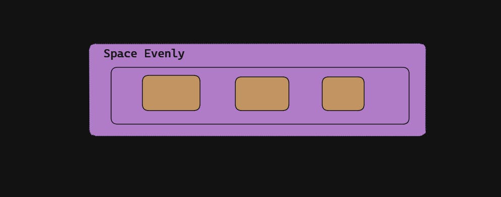
justify-content:space-evenly; /*items are distributed so that the spacing between any two items (and the space to the edges) is equal.*/
Let's explore this property with the help of figures.
There is a detailed guide that MDN has released here regarding the version support as some values don't support a few browsers. Anyhow, flex-start, flex-end, and center are the safest values to consider while building the website.
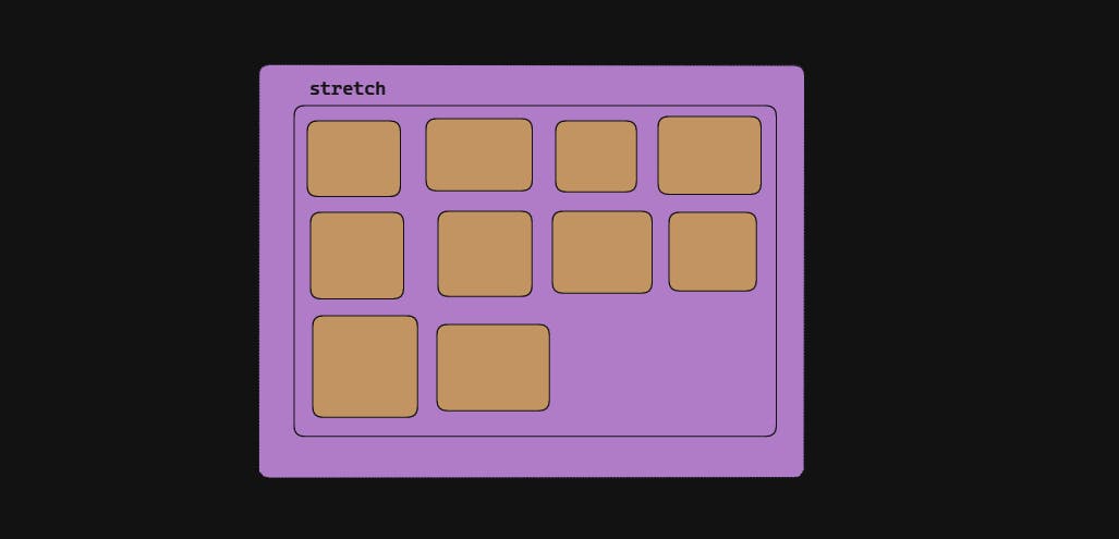
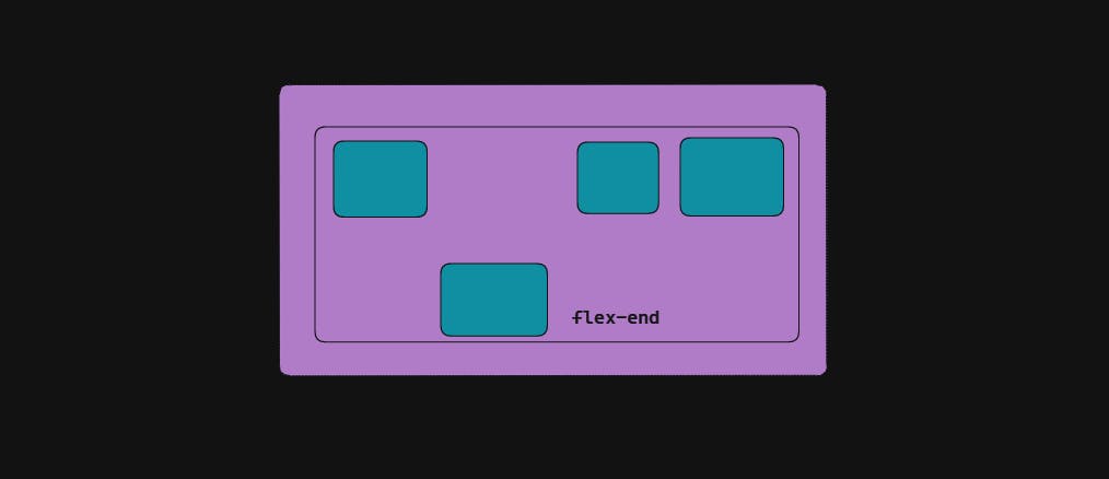
Align Items
The align-items defines how the child should be aligned along the cross-axis of the flex container. When everything is at default value think of this property as justify-content the vertical axis(top to bottom).
align-items:flex-start; /*items are placed at the start of the cross axis.*/
align-items:center; /*items are centered in the cross-axis*/
align-items:flex-end; /*items are placed at the end of the cross axis.*/
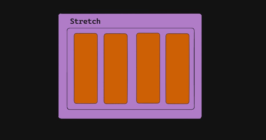
align-items:stretch; /*stretch to fill the container(respective to min/max width)*/
align-items:baseline; /*items are aligned such as their baselines align*/
Let's explore this property with the help of figures.


This is how the items behave around the cross-axis on the current line. Like justify content this has browser support as well that has been documented by MDN.
Flex-Wrap
Suppose you have multiple div inside a container and due to the screen size or small width, the items get shrunk. This is a major issue in development especially when we design responsive pages or for smaller screen devices. The flex-wrap property enables the items to not be squeezed and stack up in a particular direction.
 #container{
     display:flex;
     flex-wrap:nowrap; /*all flex items will be on one line*/
     flex-wrap:wrap; /*flex items will wrap onto multiple lines, from top to bottom.*/
     flex-wrap:wrap-reverse; /*flex items will wrap onto multiple lines from bottom to top.*/
 }
Let's understand this with examples and figures.

In the above example, the flex-direction is set to the default value: row.
The Red is set to no wrap.
The yellow is set to wrap.
The blue is set to wrap-reverse.
To explore more properties of the flex-wrap, check it out in the official documentation by MDN.
Align-content
The property align-content utilities the extra space in the cross-axis. Likewise, justify-content does the same thing but on the main axis.
Note: Only multi-line flexible containers with flex-wrap set to wrap or wrap-reverse are affected by this feature. If flex-wrap is set to its default value, no-wrap, a single-line flexible container won't reflect align-content.
.container {
  align-content: flex-start; /*items packed to the start of the container.*/
  align-content: flex-end; /*items packed to the end of the container.*/
  align-content: center; /*items centered in the container*/
  align-content: stretch; /*lines stretch to take up the remaining space*/
  align-content: space-between; /*items evenly distributed; the first line is at the start of the container while the last one is at the end*/
  align-content: space-around; /*items evenly distributed with equal space around each line*/
}
Let's understand the concept with diagrams.


In the official document, you can find the browser support and prevent aligning elements such that the content becomes inaccessible.
Order
The order property defines the order in which the child element should appear within the flex container. The order is an individual property where the lowest number is given the highest priority and the highest number will go at the end. Let's understand this with an example.
item1{
 order:-1; /*tem1 will be placed at the very start.*/
 }

item2{
order: 5; /*item2 will be placed after the item1.*/

Note: If 2 divs have the same order then it is on a first come and first serve basis.
Align-self
The align-self the property allows us to override the align-items property for a specific child element within a Flex container.
For example, let's say we have a Flex container with two child elements, and we want to align the first child element to the center of the cross-axis (vertically), but the second child element should be aligned to the start of the cross-axis. We can achieve this by using the align-self property on the second child element.
Let's understand with the example:
.flex-container {
  display: flex;
  align-items: center;
}

.flex-item-1 {
  /* This element will be centered vertically */
}

.flex-item-2 {
  align-self: flex-start;
  /* This element will be aligned to the start of the cross axis */
}

Apart from this, there are auto, centre, baseline, and stretch property that can be learned from the official documentation.
Flex-Flow
The flex-flow is a shorthand property that combines flex-direction and flex-wrap properties. It allows us to set the direction to the main axis as well as to wrap its child element with just a single line of code. Let's see the example of flex-flow:
.flex-container {
  display: flex;
  /* flex-flow: <'flex-direction'> */
flex-flow: row;
flex-flow: row-reverse;
flex-flow: column;
flex-flow: column-reverse;

/* flex-flow: <'flex-wrap'> */
flex-flow: nowrap;
flex-flow: wrap;
flex-flow: wrap-reverse;

/* flex-flow: <'flex-direction'> and <'flex-wrap'> */
flex-flow: row nowrap;
flex-flow: column wrap;
flex-flow: column-reverse wrap-reverse;
}
Note: The default value is row nowrap.
You can get more ideas from the official documentation from MDN.
Games to Develop Flexbox Knowledge
Here comes the interesting part where we can develop our flex-box knowledge and master it using the games. Yes! you heard it right. In this section, we are going to discuss the games that can help you master the flexbox and clear all confusion at once with fun.
Flexbox Froggy
Flexbox Froggy is a popular online game that helps developers learn and practice using Flexbox to create layouts for web pages. In this game, players are presented with a series of challenges that require them to use Flexbox properties and values to position and align a group of colorful frogs on lily pads.

Flexbox Froggy is designed to be a fun and engaging way for developers to learn and practice using Flexbox, which is a powerful tool for creating responsive and flexible layouts for web pages. The game provides instant feedback on the player's progress and allows them to experiment with different Flexbox values and see how they affect the layout of the frogs.
Overall, Flexbox Froggy is a great way to learn Flexbox while having fun at the same time!
Flexbox Defense
Flexbox Defense is a tower defense game that is designed to help developers learn and practice using Flexbox to create layouts for web pages. In this game, players must defend their base from a series of incoming enemy attackers by strategically placing and upgrading towers that use Flexbox properties to attack and defeat the enemies. Each tower in the game corresponds to a different Flexbox property, such as justify-content, align-items, and flex-direction and players must use their knowledge of these properties to create effective tower layouts and defeat enemies.

Flexbox Defence offers immediate feedback on the player's progress and is intended to be both entertaining and informative. The game has several levels, and each one adds fresh Flexbox ideas and adversary types, making it difficult for players to stop honing their abilities and tactics. The degree of difficulty and the towers that go into a player's defense may both be changed in this extremely configurable game.
Another super cool CSS game to learn flex is Knights of the Flexbox Table. This is an online role-playing game where players create a character and embark on a quest to explore a magical kingdom filled with challenges and enemies. Along the way, players must use their knowledge of Flexbox to navigate obstacles and defeat enemies in battles that are won through the clever use of Flexbox properties. The game provides players with a variety of challenges and puzzles that require them to use Flexbox properties and values to solve problems and progress through the game.
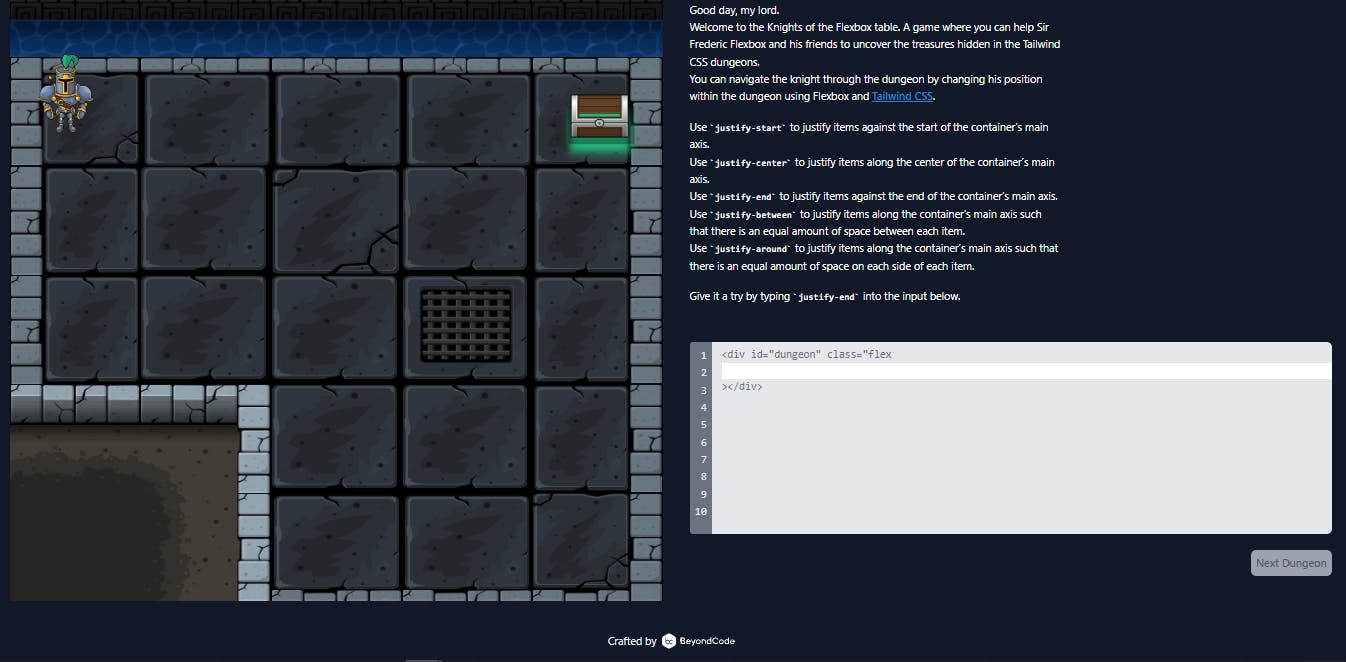
The game is set in a fantasy world filled with characters and creatures that are inspired by Flexbox properties and concepts. For example, players might encounter a powerful wizard who represents the flex-grow property, or a fierce dragon that represents the flex-wrap property. It has 12 levels, and it's pretty cool to see multiple answers can be correct.
Flexbox Adventure is an online game where players take on the role of a hero who is on a quest to explore a mysterious world filled with obstacles and challenges. Along the way, players must use their knowledge of Flexbox to navigate through various obstacles and reach the end of each level.
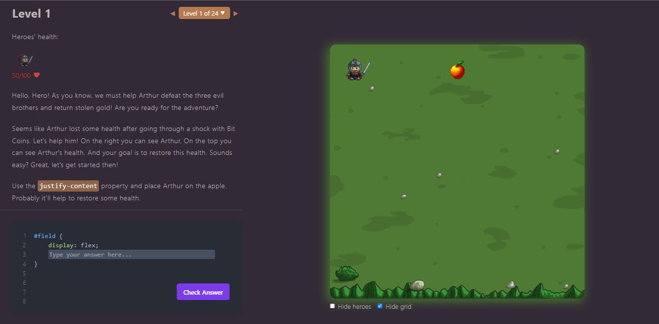
Flexbox Adventure is a great tool for developers to learn and practice using Flexbox, which is a powerful tool for creating responsive and flexible layouts for web pages.
Conclusion
Flexbox is a crucial skill for web designers and developers and is frequently utilized in contemporary web development. By using these Flexbox properties and values, developers can create flexible and responsive layouts that adapt to different screen sizes and device orientations. With this cheat sheet, you can quickly and easily reference the most important Flexbox properties and values to create stunning and responsive layouts.
If you find this article insightful do share this with your developer friends. Find more related articles about GitHub Cheat Sheets, Markdown Cheat Sheets, and many more.
Happy Learning! Happy Coding! 😀