


As we know CSS is for designing the web page and giving HTML syntax meaning to the page. The process of designing beautiful pages via CSS is incomplete without the knowledge of positioning the HTML elements in the webpage. So, what exactly is CSS positioning, and why it is important ???
In simple words, the location of an element within a document is specified via the CSS position attribute. The final position of an element on a page is determined by this attribute in conjunction with the left, right, top, bottom, and z-index properties.
There are five different position values:
- static
- relative
- absolute
- fixed
- sticky
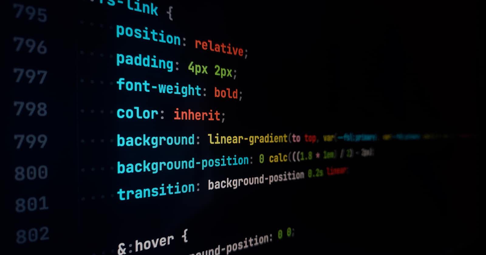
Syntax
position: static;
position: relative;
position: absolute;
position: fixed;
position: sticky;
Let's discuss each one separately.
Static
Static is considered to be the default value for elements. In this, the elements are positioned according to the normal flow of the document. The right, left, bottom, top, and z-index properties do not get affected with "position: static".
<html>
    <body>
        <div class="parent-element">
            <div class="sibling-element">
                I'm the other sibling element.
            </div>

            <div class="main-element">
                All eyes were on me. I am the main element.
            </div>

            <div class="sibling-element">
                I'm the other sibling element.
            </div>
        </div>
    </body>
<html>
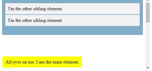
Let's give the div with the class main-element position: static and left, top values. To set apart the other divs from the focal point element, we also add some styles to them.
.main-element {
    position: static;
    left: 10px;
    bottom: 10px;
    background-color: yellow;
    padding: 10px;
}

.sibling-element {
    padding: 10px;
    background-color: #f2f2f2;
}
OUTPUT
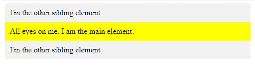
Did you notice that there's no change? This demonstrates that an element with the property set to "static" is unaffected by the left and bottom properties.
Relative
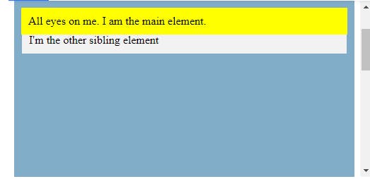
The element is placed by the document's natural flow, and its offset from itself is determined by the values of top, right, bottom, and left. The element is given a relative offset based on the values of the left, right, top, and bottom properties. Let us check the result in the same example by replacing static with a relative.
.main-element {
    position: relative;
    left: 10px;
    bottom: 10px;
    background-color: yellow;
    padding: 10px;
}
OUTPUT
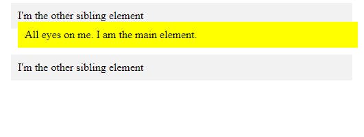
You'll see that the element's position is now influenced by the left and bottom properties. Also, take note of how the element continues to follow the document's natural flow and how the offset is applied relative to the element itself. As we move on to other values, remember this. This value creates a new stacking context when the value of the z-index is not auto.
Absolute
An element with the position attribute is placed about its closest ancestor (instead of positioned relative to the viewport, like fixed).
The document body is used and the element scrolls with the page if an absolute positioned element has no positioned ancestors. That means that the parent element has to have a position value other than position: static. If the nearest parent element is not positioned, it is positioned about the following parent element. It is positioned relative to the HTML element if there isn't a positioned ancestor element.
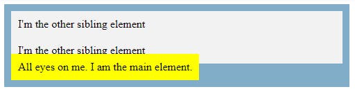
Returning to our original example, In this instance, we switch the main element's position to position: absolute. To prevent it from being positioned relative to the HTML element, we will also give its parent element a relative position.
.main-element {
    position: absolute;
    left: 10px;
    bottom: 10px;
    background-color: yellow;
    padding: 10px;
}

.parent-element {
    position: relative;
    height: 100px;
    padding: 10px;
    background-color: #81adc8;
}

.sibling-element {
    background: #f2f2f2;
    padding: 10px;
    border: 1px solid #81adc8;
OUTPUT
Fixed
Positioned relative to the viewport, an element with the attribute position: fixed; always remains in the same location regardless of how far the page is scrolled. The element's position can be adjusted using the top, right, bottom, and left properties.
One thing to note is that fixed elements are not affected by scrolling. They always stay in the same position on the screen. When an element is fixed, its original place on the page is not left blank. Let's understand this with the example :
.main-element {
    position: fixed;
    bottom: 10px;
    left: 10px;
    background-color: yellow;
    padding: 10px;
}

HTML {
    height: 800px;
}
OUTPUT
Sticky
The position: sticky is a mix of position: relative and position: fixed where up to a specific scroll point, it behaves as a reasonably positioned element; after that, it behaves as a fixed element. Here's the example:
.main-element {
    position: sticky;
    top: 10px;
    background-color: yellow;
    padding: 10px;
}

.parent-element {
    position: relative;
    height: 800px;
    padding: 50px 10px;
    background-color: #81adc8;
}
To view the outcome, scroll down on the result tab. You can see that it behaves as a relative element up until it reaches the top: 10px of the screen, at which time it behaves exactly like a fixed element.
So let's summarise the article and we hope that you find this article helpful and understood the CSS positioning and its properties. To understand more the best way is to constantly practice with the tools and eventually you'll get better at it with time.